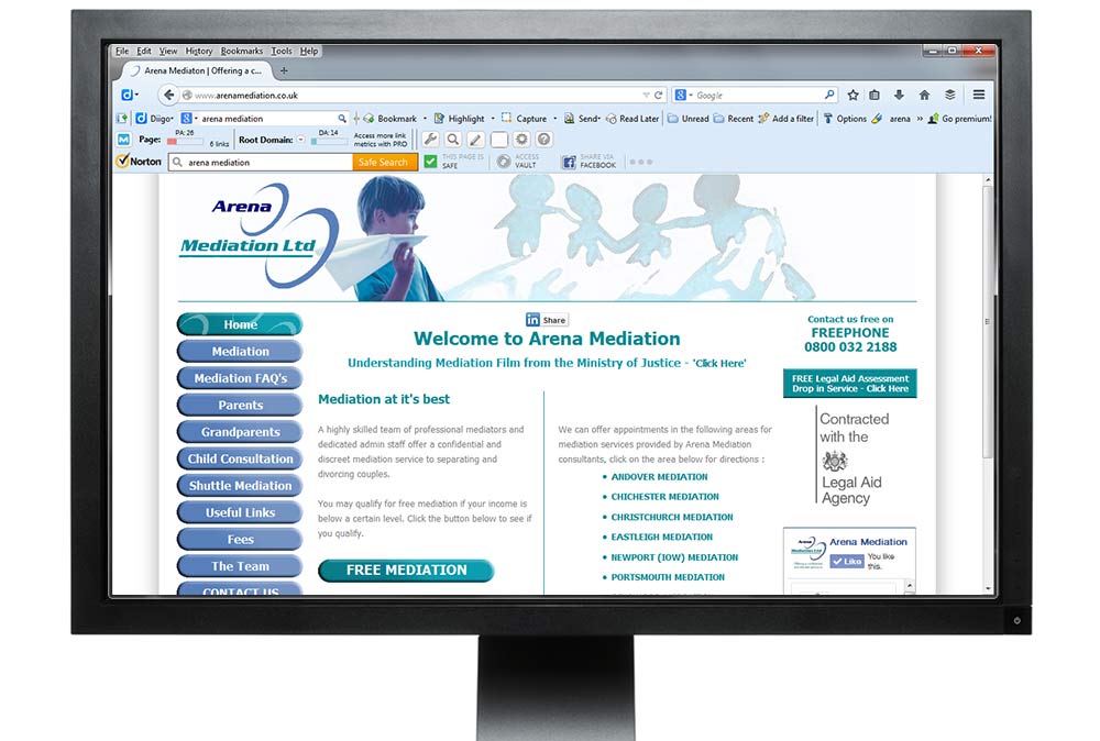


Non responsive websites are still the most commonly seen website on the web for obvious reasons but are becoming a thing of the past. Search engines strive to provide good user experience and with the huge uptake of mobile devices it’s not unlikely that responsive websites will be served higher in search results as time passes. The slides show a non-responsive site design from 2011 and how it appears in a variety of devices and on desktops.
Live Preview